Drawing
Charcoal
The purpose of this drawing was to explore value more in depth. I challenged myself to use more whites, instead of staying with darker colors, as I typically do. It resulted in a stark contrast of black and white values that made the work "pop" more in my opinion. Value was my main focus, so instead of just drawing objects and lines, I wanted value to form the objects in the drawing.
I was inspired by the landscapes of Nina Weiss. Nina portrays the motion of the landscape in her work. All of the 'squiggles' work together in harmony to become the image. I was also inspired by the subject, the castle. While it is "falling apart" it still all comes together in perfect harmony. All the lines and values work together to make the image. I feel at home here because although it is falling apart, as life sometimes does, there is still a breathtaking grandeur that it produces. Amongst an ordinary forest, it is a hidden gem. One of the challenges in this piece was remembering to use light shades more, as I tend to gravitate towards using darker values. While there still are a lot of dark values, I am happy with the range of values. I think it made the piece more eye catching with the harsh contrast of values. I also struggled with combining the aspects of architecture and nature. While wanting them to look unified, I also didn't want to castle to completely blend in to nature, rather be framed by nature. Remembering to use more defined lines for the castle helped me achieve that. I am happy with the outcome. Overall, this piece taught me a lot about value. Pen and Ink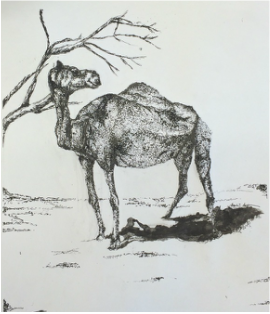
The inspiration behind this piece is an intrinsic part of my life. Camels are not essential to my life, neither is the desert, but the moment that picture was taken is. I took this picture during a trip to the Middle East in which we were dune bashing and the car broke down and we were stuck in the desert for some time. While waiting for someone to come and pick us up, I got to pause and really take in the surroundings of the desert. We walked over to the wild camels standing nearby and I realized that sometimes when you hit the pause button on life and really take in your surroundings, life can be beautiful. Too often when I travel, I am too busy taking photos to put on social media and looking for a wifi connection to text people back from back home. That moment in the desert, without an internet connection and connection to society made me appreciate the simplicity of nature and how diverse our world really is. Travel is intrinsic to me. It reminds me to stay humble and appreciate every little thing I would normally take for granted. It helps me empathize more with others instead of being quick to judge. Many of us live with this idea that we are the center of the universe and it is in our nature to constantly look out for ourselves and only ourselves. We become obsessed with money or technology and forget that we can live without those things. Because I've been blessed enough to have the opportunity to see a lot of the world, I've come to realize the best parts of traveling are not going to five star hotels or shopping on the Champs-Elysses, but the best parts are seeing smiling people in the slums of India and finding peace in the Arabian Desert, because that is when you realize that what we get wrapped up in has no intrinsic value.
I used stippling for the camel in this piece because it is a great technique to portray the texture and wide value variation of the camel's fur. I also used it to portray the texture of the sand. I used hatching for the tree to show the bark had a vastly different texture than the camel, and to portray the bark more accurately, as it contained a rhythm and variety of lines. This project helped me grow because it forced me to pay close attention to detail because I could not erase the ink. I also realized there is much more of a value scale in nature by paying very close attention to value change. I typically categorize multiple values into one value while working in pencil without really thinking about it, but through this pen and ink, it took much longer to block in value and I realized how much value really vary. It taught me not to rely on an eraser as a safety net, and when I spilled ink underneath the camel, I turned it into the shadow of the camel. I originally thought I would be stippling the shadow to reflect the texture of the sand, but I am much happier with this outcome than the original plan. This project taught me to take my time with my art, and look at the little things that make up the big picture, as I typically look at the big picture first. It gave me a new perspective to look at things in a different way and gave me more appreciation for detail. Portrait Drawings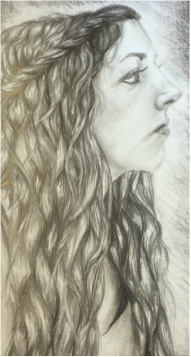

I chose Sara for my first portrait because not only do I know her well enough to really portray her personality, but I also wanted to expand my knowledge and mastery of value by drawing her textured hair filled with contrasting values to make the hair really become a vocal point. The dark values help emphasize the lighter tones, causing light parts to stand out. Ryan was the first male portrait I had done, mainly because of reluctance to draw ears. In females, usually their ears are covered up by hair, so I would use it as an excuse to not draw ears. However, drawing Ryan's ears aided me in the further realization that face is made up of values, not lines. Value makes form. I also learned from the portrait of Ryan how to utilize the blending stump correctly. There is a fine balance between overusing and not enough use of blending. Things left unblended leave texture, which is something almost always essential to make the piece. However, for smooth things like skin and folds in clothing, blending stumps are perfect. Rose Franzten was an inspiration to me while working on these pieces. Rose captures people as themselves, not posing or fake. I tried to capture Ryan and Sara as close to how they are in real life as possible. Rose emphasizes minute details in the faces. While menial, they still make up the expression and characterization of the subject. Without emphasis on those details, the person would just be a generic person. Their little quirks make them who they are, which is something I tried to incorporate. I learned a lot about attention to small detail and about the vastness of value on the grayscale from this piece. Although I knew there were infinite values to make up a piece, I never really experimented with so many values until this project. This project expanded my knowledge of value and patience with detail greatly.
|
Oil Pastel
This project was made to convey the problem of overthinking, something that not only effects me, but also millions of others across the world. America today has reached a point where the youth no longer appreciates receiving an education because the stress of getting good grades, correlating with getting into a good college, has overtaken the excitement of expanding your knowledge. Students are constantly overthinking about grades. Social media and the internet has enabled our generation to be constantly consumed with others thoughts and receiving immediate responses from friends. We have become defined by the number of followers we have and the number of messages in our inbox. We over analyze our appearance in society. Our generation is constantly overthinking about their appearance through social media. Overthinking has gone overboard. Our brains are constantly bombarded with stress and the idea that we must do everything to be socially acceptable to succeed in life.
I was inspired to use the bold colors by a recent trip to Casco Veijo in downtown Panama City, Panama. The quaint historic streets were filled with bold graffiti. The contrast stood out to me and was a contributing factor that made me stay with only the word being in color, as I think it makes much more of a statement. It shows how something delicate can be transformed into something that screams and still be beautiful. The main inspiration for the image, however, was the feeling I get when I overthink. There are so many different thoughts that they all blend together and make my head want to explode. Another reason I made the font colorful but left the face black and white was to portray how overthinking draws the life out of us, leaving us dismal and grey. The thoughts become so overwhelming our heads we can only contain them for so long. This project was a challenge for me because I tend to stay away from bright colors in my work, leaning more towards value and shading in black and white. Creating a color gradient within the letter caused me to become more comfortable with using color while still creating depth. I also became more comfortable with the technique of blending, as that is something I don't typically do in my work. I believe this piece shows how our thoughts explode when we become overwhelmed. Overall, this piece taught me that color, too, can add depth to a piece. Colored Pencil Grid Drawing
I chose this sunflower because not only does the lighting help challenge me in expanding my mastery of value, but the color variation I felt made the picture pop. The little bits of red contrast the blue background along and the warm colors of the flower contrasting the cool colors of the stem, which I really makes many aspects of the image pop. This project was a challenge for me because I like to add my own interpretation to my work but because this was a grid drawing and had to be copied exactly, there was not much room for creative license. However, this project has helped me pay much closer attention to detail and has helped me remember to take my time. Sometimes when I have an idea for a project, I get overly excited and rush through the project and the end result is not my best work. This piece taught me a lot about patience and taking my time.
I struggled a lot with the center of the sunflower and kept putting it off because I was hesitant as to how to precisely and accurately portray that portion of the flower exactly, as I had done with the rest of the image. Everything else seemed so exact in the image, but there were too many seeds in the middle to copy them one by one. There were also many colors in the picture, but when I drew them all on the piece, it just looked as though Georges Seurat had used too many colors in the middle of a sunflower. The variety of colors seemed to clash with the uniformity of the flower. However, after much trial and error, I decided to trust my instincts and just continue with the technique. In the end, although it isn't the most realistic part of the piece, I really like how it turned out because it reflects my own artistic style amidst a very mainstream-looking drawing. Nina Weiss has always been a huge inspiration to me because she is not afraid of color, which is the opposite of my art style. I typically stay with black and white because I like to emphasize the image through stark contrasting shades that, in turn, make the piece more dramatic. I have previously stated her as my source of inspiration, but she also was a major inspiration for this piece. Her fearlessness with color inspired me, too, to be fearless with color and take a risk. I love the results from this, with the hints of red that contrast the blue, the navy blue, and multiple shades of yellow. Without inspiration from her, this piece probably wouldn't pop as much, from fear of color overload. While I still would chose black and white over color, I have become a lot more comfortable with using color through this project. |
